
Behind the SCenes
The Making of the All-In Website
How it Started
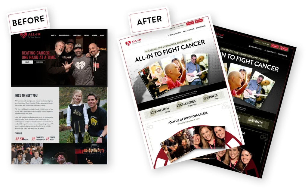
In late 2023, our Digital Experience team at Experis heard about an opportunity to redesign and improve All-In’s website. The older website wasn’t terrible, but it had some rough edges and wasn’t seeing the desired levels of engagement.
Experis agreed for our team to take on this project as a donation to All-In, allowing us to improve the design, tone, performance, accessibility, and ease of editing among other changes.
Timeline
A quick summary of our work.
As an Agile team, we work in sprints. Aside from Sprint 0, all sprints are one week long where planning takes place on Mondays and a demo is presented every Friday.
- Pre-engagement
December 2023 -
Website Analysis
A report card for the current site.
Before deciding to take on the work, we wanted to make sure a complete redesign was the right path to take. We tested the website against various metrics and provided feedback as a kind of “report card” for areas of the site that could be improved.
Afterwards, All-In agreed that a new design and architecture would be beneficial.
- Sprint 0
April 2024 -
TrueStart
Our discovery and UX process.
We interviewed over a dozen All-In stakeholders and board members, collated art assets and documentation, and planned the features and graphic style that would be most useful and appealing to All-In’s audience.
-

Leveraging AI
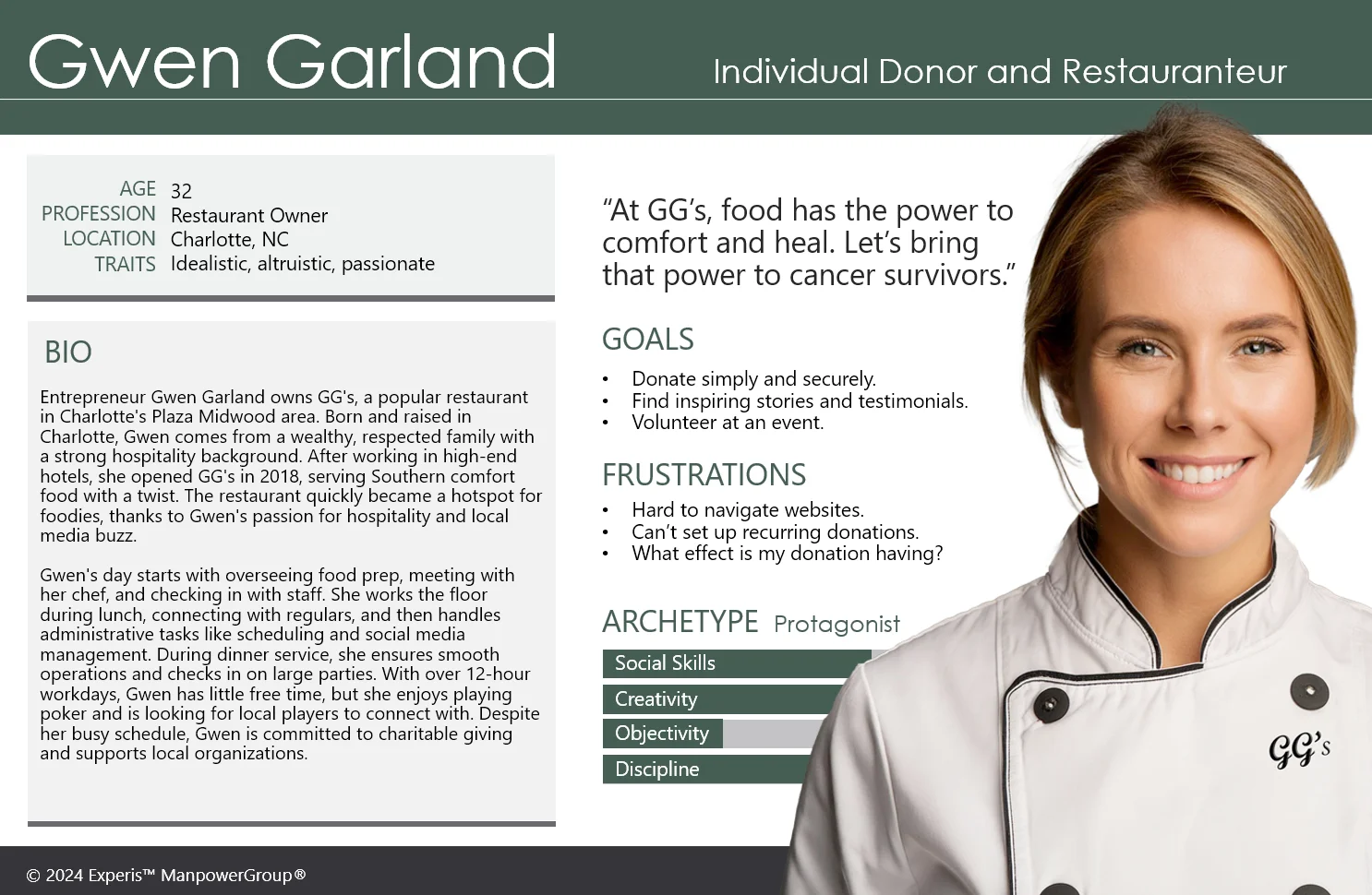
A typical TrueStart includes surveys, interviews, documentation, and common UX activities such as persona and journey map creation.
For All-In, we took advantage of AI to summarize interviews, generate photo-realistic people for personas, and to create scenarios for user journeys.
- Sprints 1–4
-
A Custom Design System
Future-proofing All-In’s design.
Figma has become the standard for building professional UIs for websites and apps. Our team has created a Figma design system from scratch that includes spacing, color, and typography systems as well as a component library where all aspects are designed in a reusable manner for use in future projects.
- Sprints 2–10
-
Storybook
Performant, accessible design components.
As designs are finalized in Figma, our front-end developers begin writing the code that will bring the individual design components to life.
Storybook provides a development environment, interactive component library, and functional preview so stakeholders can see exactly how their website will perform when complete.
- Sprints 6–12
-
WordPress
Intuitive editorial control.
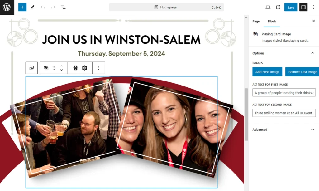
WordPress, the world’s most popular CMS, allows All-In’s authors the ability to add and change content anywhere on their website. We took full advantage of WordPress’ patterns feature so pages can be created in minutes by simply dragging and dropping predefined designs, then replacing the text and image content.
-
What is a TrueStart
Starting projects on the right foot.
A TrueStart is the opposite of a false start. It’s easy to think you have all the info you need and to start designing mock-ups and writing code, but that’s a good way to box yourself in, only to realize later that you made a critical oversight.
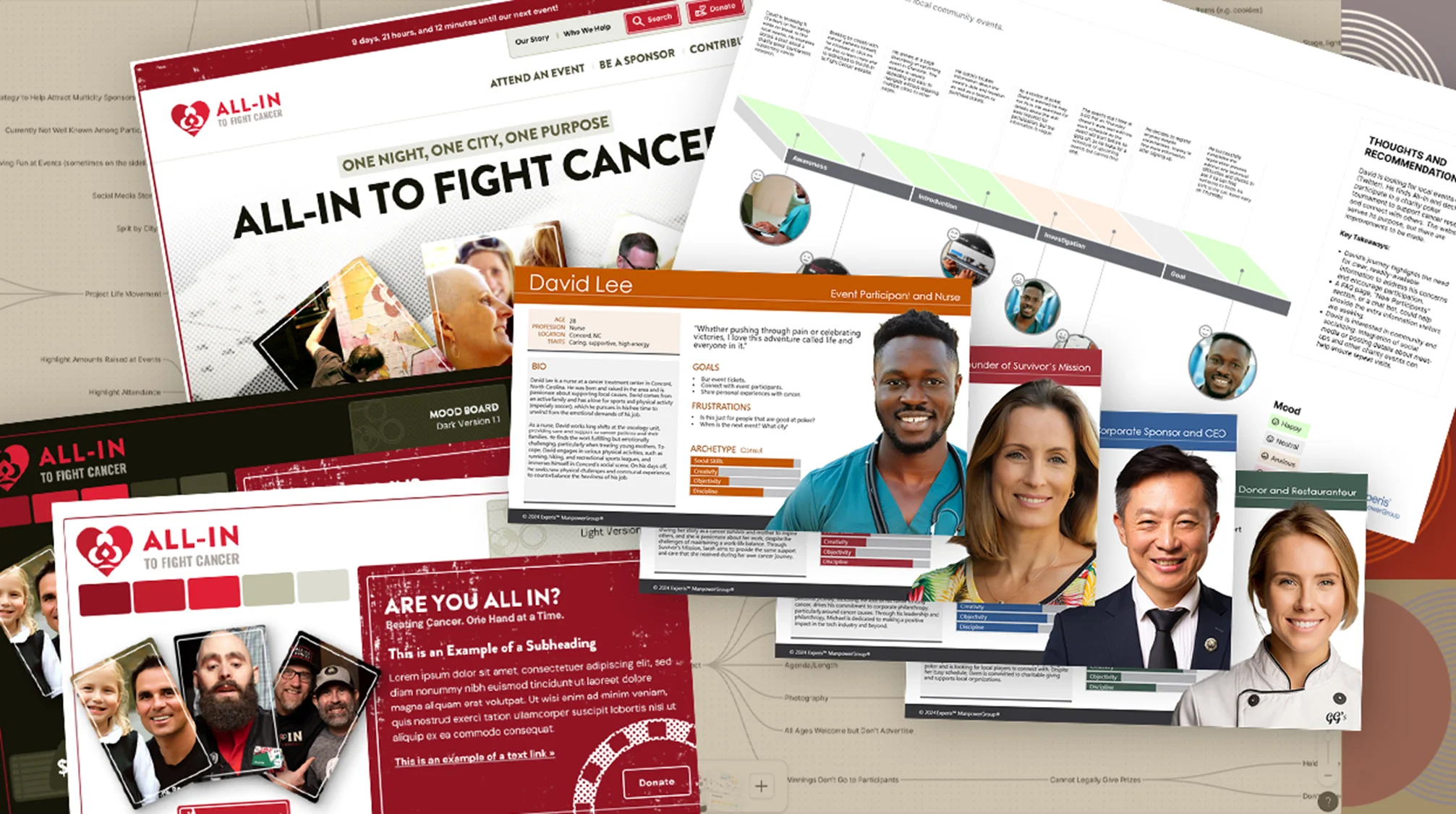
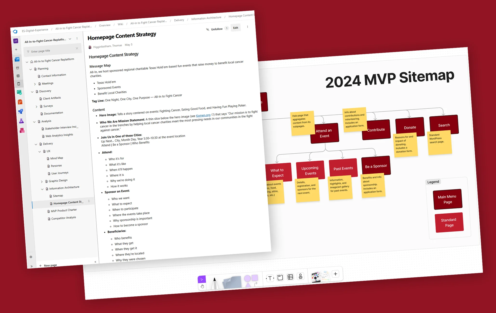
Interviews, surveys, mind maps, competitor analysis, target audience identification, SWOT analysis, priority matrices—these are some of the activities and assets that we use during our TrueStart process to make sure we have a full understanding of the proper direction for the project.
We create personas, journey maps, and mood boards to make sure we’re building a website that meets the needs and expectations of the right people. Then, we work on the architecture and a detailed backlog filled with epics and user stories so that designers and developers have all they need to build a stellar website.
Experience Design
Storytelling through interaction, where every touchpoint is an opportunity to enhance the user’s journey. Experience design is the craft of creating meaningful and engaging interactions.
Watch our video to learn more about how we use psychology and design thinking to create moments that delight and resonate with users.
Image Upscaling
How we improved existing assets.
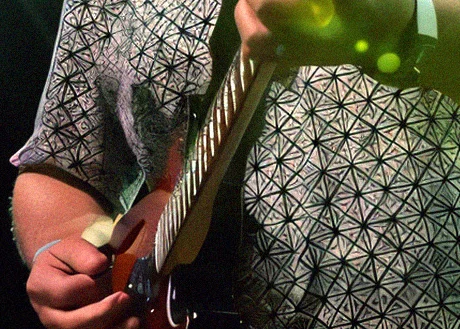
Some of the original image assets were fairly small and compressed. Taking advantage of AI upscaling techniques with Stable Diffusion and some light Photoshop retouching, we were able to bring these photos back to life.



Design Systems
Why we think they’re essential
A design system is the cornerstone of a successful website because it ensures brand consistency, design efficiency, and scalability. Imagine a website where every page feels like part of a cohesive journey. That was the goal with All-In’s redesign.
By implementing a design system, we were able to accelerate the design process, reduce inconsistencies, and foster a creative environment. This meant faster time-to-market, lower costs, and a seamless experience that keeps users engaged and converts visitors into brand advocates. In essence, a design system doesn’t just build a website; it crafts a digital ecosystem where brands thrive.
Choosing a CMS
Making website management simple.
There are many reasons to choose WordPress as a content management system, but in this case, there were three stand-out objectives.
- Cost
- Ease of use
- Flexibility
All-In’s previous website was also built on WordPress, and we saw no need to switch to another system that would likely have a larger learning curve. WordPress has a user-friendly interface, can adapt to a variety of needs, and you can’t beat the price.
Website Metrics
Our PageSpeed Insights scores are incredible!
The old website had some decent Lighthouse scores, but we wanted to take things up to the next level. With a 30% performance increase for the homepage and 100s in every other category*, we think we did a good job.
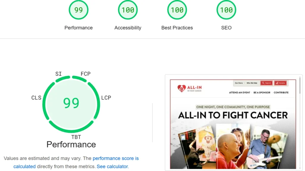
* Desktop Lighthouse scores accurate as of 8/16/24.
More Points of Interest
There’s so much more that went into this project.
- Automatic light and dark mode designs. (Give it a try!)
- Development best practices (linting, unit testing, a11y, and more).
- Easy navigation for users of screen readers and other assistive technologies.
- Custom Full-site Editing (FSE) WordPress theme.
Our Team
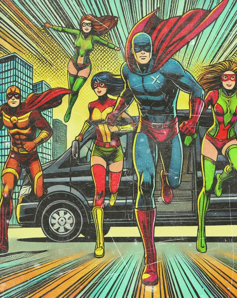
The Experis All-In team.
Ready to revamp your website? Our talented team is always looking for exciting new projects to build.

Richard Brown
Principal Consultant

Thomas Higginbotham
Architect and Designer

Sean McMillan
Senior Developer
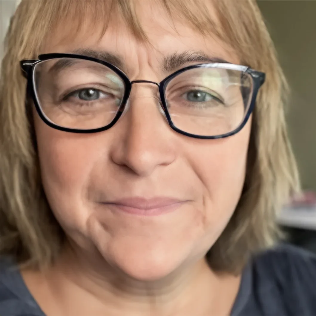
Laura Oliver
Business Analyst / Engagement Manager

Klea Garcia
Business Analyst / Engagement Manager
Contact Experis
Let us build your next web experience.
